Make Firefox look OK
When I open a freshly installed Firefox browser, it does not look good.
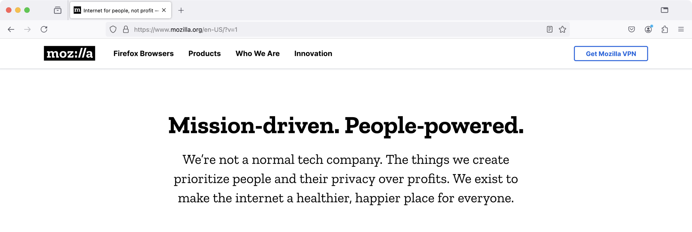
Firefox 131 on macOS
It needs a bit of fine-tuning to look better. When you spend much of your day inside the browser window, the browser needs to become invisible.
Since I posted the original note, Firefox added a native support for vertical tabs. That’s the mode I’m using now. See the updates in the end of this post for the latest styles.
Firefox 146, late 2025
These are the steps to make it look OK:
1. Enable “compact” mode
In about:config, set the browser.compactmode.show setting. This will show the otherwise hidden, “Compact” density mode in the “Customize toolbar” menu. Set the density mode to compact.
2. Disable favicons
Disable the browser.chrome.site_icons setting. This removes the site icons from the browser’s tabs.
3. Disable tabs preview
Disable the browser.tabs.hoverPreview.enabled and browser.tabs.hoverPreview.showThumbnails settings. This disables the previews when one hovers over the tabs, and just show the tooltip.
4. Enable userChrome.css
Activate the toolkit.legacyUserProfileCustomizations.stylesheets setting.
Then, create a userChrome.css file in the Firefox’s current profile directory, %PROFILE%/chrome/userChrome.css, and add the styles:
:root {
    &[uidensity=compact] {
        --tab-min-height: 24px !important;
    }

    --tab-block-margin: 3px !important;
}

#tabbrowser-tabs {
    .tab-background:is([selected], [multiselected]) {
        box-shadow:
            0 0 1px inset rgba(0,0,0,0.1),
            0 -1px 1px rgba(0,0,0,0.1),
            0 1px  1px rgba(0,0,0,0.1),
            0 0    2px rgba(0,0,0,0.1),
            0 0    4px rgba(0,0,0,0.1),
            0 0    6px rgba(0,0,0,0.05) !important;
        outline: none !important;
    }

    .tabbrowser-tab:not(:hover) .tab-close-button {
        display: none;
    }

    .tab-close-button {
        width: 18px !important;
        height: 18px !important;
        padding: 3px !important;
    }
}

#alltabs-button {
    display: none !important;
}

#navigator-toolbox .titlebar-spacer {
    width: 10px !important;
}
5. Install a good light theme
I use the “Safari - MacOS Monterey Light” theme, which is very minimal and fits nicely into macOS.
Update 2025-07 Lately, inspired by Zen browser, I’ve revisited the styling to make the browser even more compact and minimal.
One thing that I really don’t like about Zen browser, is that it — similar to Arc and similar to Opera before both of them — frames the whole browser window with an annoying border 🖼️. This looks sexy on screenshots. But this makes no sense when a browser window is expanded to fill the whole screen.
In contrast, this is how my Firefox looks now:
Firefox with no URL bar, and vertical tabs enabled
The URL bar is only visible when it is in focus
The styles from the userChrome.css as of late 2025:
:root {
    --tab-selected-bgcolor: rgba(0,0,0,0.09) !important;
    --toolbar-field-background-color: rgb(255,255,255) !important;

    --tab-block-margin: 0 !important;
}

#tabbrowser-tabs .tab-background:is([selected], [multiselected]) {
    box-shadow: none !important;
    outline: none !important;
}

#tabbrowser-tabs {
    & .tabbrowser-tab:not(:hover) .tab-close-button {
        display: none;
    }

    &[orient="vertical"] .tabbrowser-tab {
        padding-block: 2px !important;

        &:first-of-type {
            padding-block-start: 6px !important;
        }
    }

    .tab-close-button {
        width: 18px !important;
        height: 18px !important;
        padding: 3px !important;
    }
}

/* Hide URL bar, unless it is in focus */
:root:not([customizing]) {
    #nav-bar {
        margin-top: -30px !important;

        &:has(#urlbar[focused]) {
            margin-top: unset !important;
        }

    }
}

/* Round the corners of the tab content */
:root:not([inDOMFullscreen], [chromehidden~="toolbar"]) {
    #tabbrowser-tabbox browser:not(.devtools-toolbox-bottom-iframe, .devtools-toolbox-side-iframe) {
        border-radius: 6px;
        clip-path: inset(0 round 8px);
    }
}

/* Render tab group labels vertically */
.tab-group-label-container {
    #tabbrowser-tabs[orient="vertical"] & {
        margin-block-start: unset !important;
    }
}
.tab-group-label {
    #tabbrowser-tabs[orient="vertical"]:not([expanded]) & {
        font-size-adjust: unset !important;
        height: unset !important;
        max-height: 96px !important;
        margin-inline: unset !important;
        margin-block: calc(var(--tab-inner-inline-margin) + (var(--tab-collapsed-background-width) - 24px) / 2) !important;
        writing-mode: sideways-lr !important;
    }
}
.tab-group-label-hover-highlight {
    #tabbrowser-tabs[orient="vertical"] & {
        margin-inline: unset !important;
    }
}