Sticky headers? Please don't
Sticky (or “fixed”) headers are everywhere. It feels that, nowadays, every web designer’s first attempt to site’s navigation starts with a sticky header. I hate this.
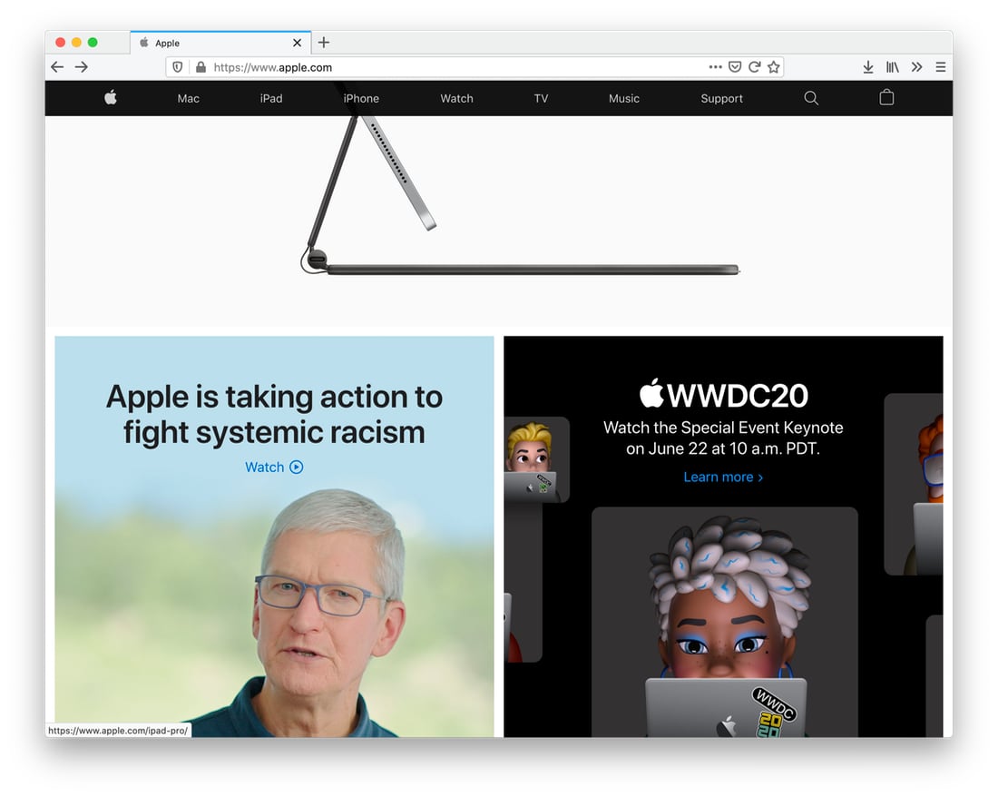
Even Apple uses sticky headers on their website. On the main page of apple.com the navigation is the same dumb bar, that hangs at the site’s top and eats a good chunk of the screen space.
But let’s go one page deep:
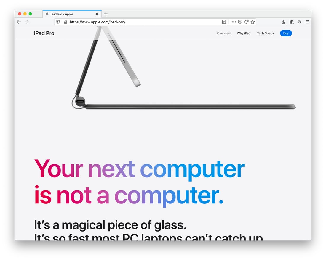
The navigation bar still floats around but at least it blends with the page. It’s contextual. It doesn’t distract you from looking at the product.
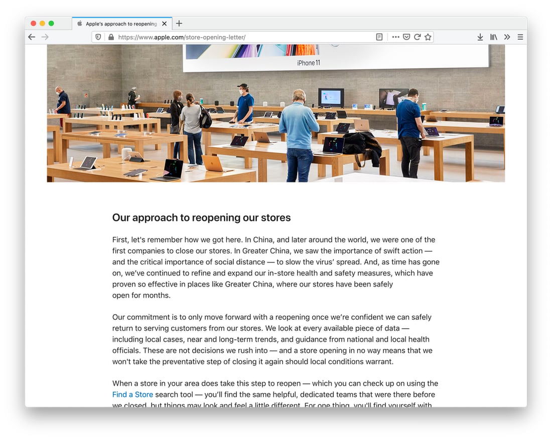
For a case, when the purpose of the page is to provide you with reading materials and doesn’t require any actions from you, the bar disapears from the design. it’s only you and the text now:
For the contrast, this is how Google does it:
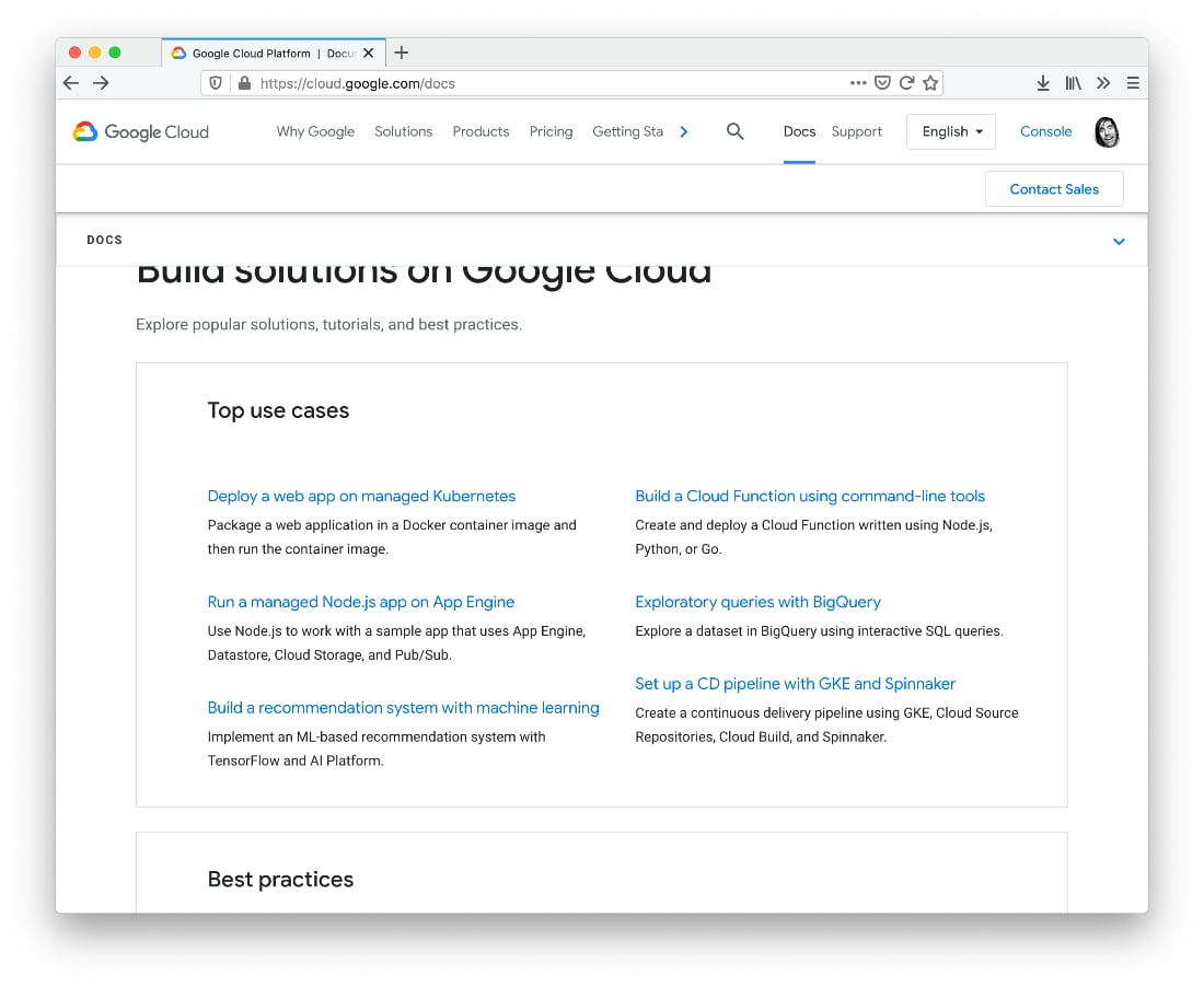
Yes, these are three sticky bars. One under another. I can’t believe there was a need for them to be on the screen all the time.
Or, this is the current design of pkg.go.dev (Google again), who is about to become the default documentation portal for Go modules and packages:
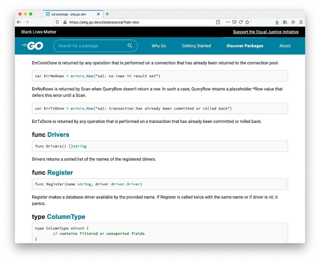
I’m sure these two sticky bars at the page’s top are very important. But I doubt they are more important than the content of this page.